
Best overall for life-science illustrations: BioRender. Best for slide-based workflows: Microsoft PowerPoint. Best open-source option for vector artwork: Inkscape. This 2026 guide compares the best graphical abstract tools for research papers by scientific fit, editing control, and the work required to communicate your finding accurately.
- BioRender leads the best graphical abstract tools for research papers shortlist for life-science illustration workflows.
- Microsoft PowerPoint suits researchers who want to assemble a graphical abstract in a familiar slide editor.
- Inkscape suits researchers who need open-source vector editing and control over custom diagrams.
- Paper Spotlight provides research promotion, not graphical abstract software; choose it for expert-led outreach after publication.
Why this matters
A graphical abstract should explain your paper's central finding without turning the figure into a miniature manuscript. Your tool needs to support that explanation—not dictate it through a convenient template.
For early-career researchers, the decision also extends beyond journal submission. A clear visual can become supporting material for research outreach, provided it preserves the paper's qualifications and directs readers to the published work. Paper Spotlight offers academic paper promotion through article analysis and targeted outreach; that is a separate service from creating the illustration.
Choose the drawing tool for scientific accuracy, then choose the promotion approach for audience relevance. Neither a polished graphic nor paid promotion guarantees citations.
What makes the best graphical abstract tools for research papers?
Use these criteria to choose your 2026 workflow:
- Scientific fit: The editor should support the structures, processes, or relationships your paper actually describes.
- Editing control: You need to revise labels, rearrange elements, and correct misleading visual relationships.
- Submission compatibility: Check the journal's required dimensions, file format, and resolution before drawing.
- Reuse permissions: Check whether illustrations, templates, and imported assets permit your intended publication and outreach uses.
- Collaboration fit: Choose a workflow your coauthors can review without rebuilding the figure.
- Learning burden: Separate the time needed to learn the editor from the time needed to explain the science.
A tool wins only if it solves your bottleneck. An illustration library helps when you need scientific assets; a vector editor helps when you need custom geometry. Neither replaces editorial judgment.
Graphical abstract tools at a glance
| Tool | Best for | Standout capability | Key limitation |
|---|---|---|---|
| BioRender | Life-science illustrations | Scientific illustration library | Library assets still require paper-specific selection and checking |
| Microsoft PowerPoint | Slide-based workflows | Familiar arrangement of shapes, text, and images | Complex custom artwork requires more manual construction |
| Inkscape | Open-source vector editing | Direct control over vector paths and objects | Requires vector-editing skills |
| Canva | General-audience research visuals | Template-based visual composition | General templates do not establish scientific accuracy |
| Adobe Illustrator | Detailed custom vector artwork | Fine control over paths and typography | Learning the editor adds work for occasional users |
| Mind the Graph | Scientific illustration-led layouts | Science-focused illustration resources | Available illustrations need checking against the exact research context |
The table separates use cases rather than treating every editor as interchangeable. For a 2026 journal submission, verify the finished export against the journal's instructions regardless of which tool you choose.
1. BioRender: best for life-science graphical abstracts
BioRender is a scientific illustration platform associated with biological and biomedical figure creation. It suits graphical abstracts built around cells, organisms, experimental processes, or biological mechanisms.
Its main advantage is starting with scientific visual assets rather than drawing every object from scratch. That does not make a diagram scientifically correct: you still need to check structures, relationships, and labels against your paper.
BioRender pros:
- Scientific illustrations support biology-focused visual explanations.
- Reusable visual elements help maintain a consistent figure style.
- Diagram composition suits mechanisms and experimental workflows.
BioRender cons:
- A convenient asset can misrepresent a structure or process if selected without checking.
- A library-led workflow is less useful when your argument depends on unusual custom geometry.
Best for: Researchers whose graphical abstract depends on recognizable life-science objects and processes.
Before committing, sketch the proposed figure without illustrations. If the argument remains unclear as boxes and labels, adding biological artwork will not fix it. Also check the permissions that apply to the assets and your intended use.
Verdict: Buy into the BioRender workflow for biology-led diagrams; skip it when scientific illustrations are not your main need.
2. Microsoft PowerPoint: best for slide-based graphical abstracts
Microsoft PowerPoint lets you arrange text, shapes, connectors, and imported images on a slide. It is a practical choice when you already use slide-based workflows and need to assemble, rather than draw, the graphical abstract.
PowerPoint works especially well for a visual argument made from labeled stages or grouped findings. Keep the composition deliberate: a slide editor makes it easy to add another box, even when the explanation needs fewer elements.
Microsoft PowerPoint pros:
- Shapes and connectors support process diagrams.
- Text and imported figures can share a single composition.
- Slide-based editing suits researchers already familiar with presentations.
Microsoft PowerPoint cons:
- Detailed custom illustrations require manual construction or imported artwork.
- Presentation-oriented layouts can encourage excessive text and decorative elements.
Best for: Researchers who need a straightforward workflow diagram or an arrangement of existing visuals.
Set the canvas proportions before placing content. Check the exported file, not just the editable slide, because the journal evaluates the delivered artwork. For a 2026 submission, use the journal's current instructions rather than dimensions copied from an old presentation.
Verdict: Buy into Microsoft PowerPoint for familiar, shape-based composition; skip it for intricate custom drawing.
3. Inkscape: best for open-source vector graphical abstracts
Inkscape is an open-source vector graphics editor. It gives you control over paths, shapes, text, and object placement, making it suitable for custom diagrams that do not fit a ready-made illustration library.
Vector editing is useful when you need to refine geometry or resize drawn elements. Imported raster images remain raster images; placing them in a vector document does not recreate their detail.
Inkscape pros:
- Open-source software supports an independent editing workflow.
- Vector paths allow custom shapes and diagram components.
- Object-level editing helps refine alignment and visual hierarchy.
Inkscape cons:
- Path editing requires practice beyond arranging slide objects.
- Scientific content and terminology still need to come from your research.
Best for: Researchers who want direct control over custom vector diagrams and can invest time in learning the editor.
Keep an editable source file alongside the submission export. Your coauthors might request a different label, grouping, or relationship after reviewing the finished composition; editable objects make those changes more manageable.
Verdict: Buy into Inkscape for custom vector control; hold if your immediate deadline leaves no time to learn the workflow.
4. Canva: best for general-audience research visuals
Canva is a general-purpose visual design platform with template-based editing. It suits researchers creating accessible summaries around a headline, a central image, and a short explanation.
For graphical abstracts, treat templates as layout scaffolding—not scientific models. A visually attractive hierarchy can still place emphasis on the wrong finding or remove a qualification that matters.
Canva pros:
- Templates provide starting points for visual composition.
- Text and images can be arranged within a consistent layout.
- General design tools suit outreach-oriented visual summaries.
Canva cons:
- General-purpose templates do not encode disciplinary conventions.
- Decorative layouts can distract from the paper's evidence and limitations.
Best for: Researchers preparing general-audience visuals to accompany a published paper, rather than detailed scientific schematics.
Distinguish an outreach graphic from a journal graphical abstract. The outreach version can explain terminology more plainly, but it must not strengthen the claim. Check asset permissions and export requirements before using either version externally.
Verdict: Buy into Canva for accessible research summaries; skip it when precise scientific drawing is the central task.
5. Adobe Illustrator: best for detailed custom vector artwork
Adobe Illustrator is a vector graphics editor for creating and refining custom artwork. It fits researchers or collaborators who need detailed control over paths, type, spacing, and the relationships between visual elements.
The advantage is control, not automatic scientific interpretation. You must supply the diagram's logic, decide what belongs in it, and verify the final composition against the paper.
Adobe Illustrator pros:
- Path tools support detailed custom illustrations.
- Typography controls help refine labels and hierarchy.
- Object-level editing supports careful composition and revision.
Adobe Illustrator cons:
- Learning vector illustration adds work for occasional figure creators.
- Extensive styling options can consume time without improving the explanation.
Best for: Researchers working with an experienced illustrator or building technically demanding custom graphics.
Agree on editable-file handover when a collaborator creates the artwork. A finished image alone is inconvenient when a journal requests changes or a scientific label needs correction. Preserve the source document and any required linked assets.
Verdict: Buy into Adobe Illustrator for demanding custom artwork; hold if a simpler editor already covers the figure's needs.
6. Mind the Graph: best for illustration-led scientific layouts
Mind the Graph is a scientific illustration platform that combines science-focused visual resources with figure composition. It belongs on your shortlist when the graphical abstract depends on recognizable scientific illustrations rather than purely abstract shapes.
Evaluate the available assets against your exact subject. A drawing that represents the broad topic is not necessarily suitable for the particular organism, apparatus, or process in your paper.
Mind the Graph pros:
- Science-focused resources provide a starting point for illustrated explanations.
- Illustration-led composition suits figures built around recognizable objects.
- Combining illustrations and labels supports visual summaries of research.
Mind the Graph cons:
- Asset suitability depends on the specific research subject.
- Every selected illustration needs checking for scientific relevance and permitted use.
Best for: Researchers who want a science-focused illustration workflow and find assets that match their paper.
Compare a rough draft with the same draft built from plain shapes. If the illustrations clarify the explanation, retain them. If they merely decorate it, simplify the layout before investing further effort.
Verdict: Buy into Mind the Graph when its scientific assets fit your paper; skip it when custom drawing is unavoidable.
How these tools are ranked
This 2026 shortlist ranks workflow fit, not measured performance or citation outcomes. BioRender leads the life-science illustration use case; Microsoft PowerPoint leads familiar slide composition; Inkscape leads open-source vector editing.
The remaining choices serve distinct needs: general-audience design, detailed custom artwork, and scientific illustration-led composition. Select against the criteria above, then check current export options and permissions before committing your figure to a particular workflow.
Prepare the explanation before opening the editor
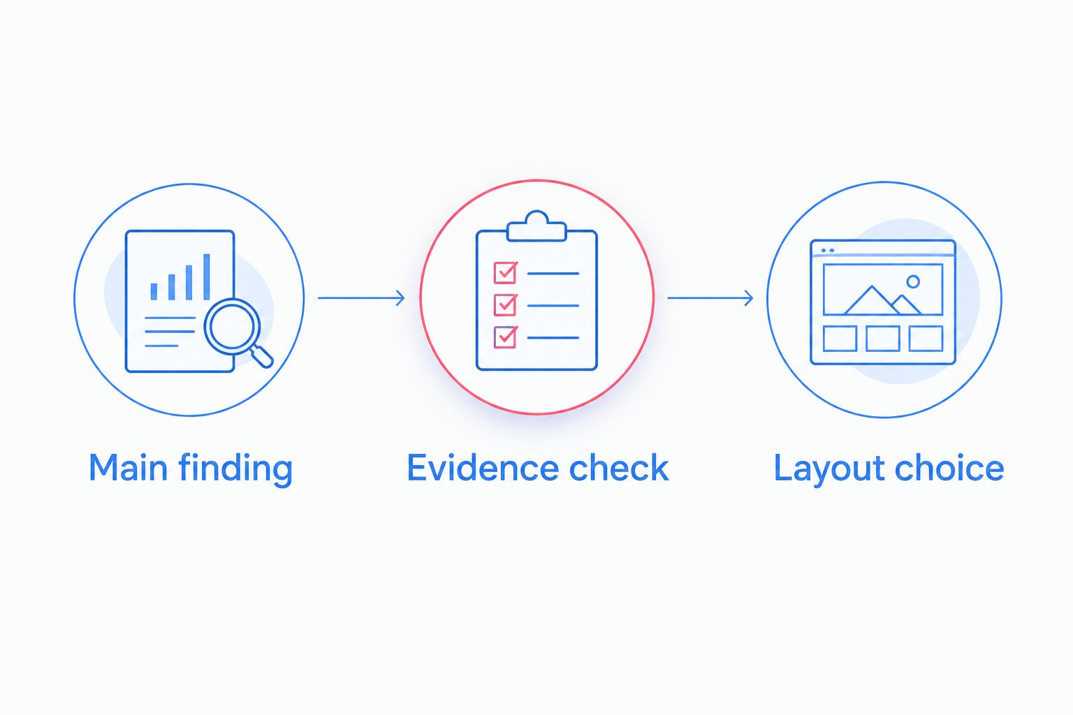
Use this sequence to turn the paper into a visual brief:
- Main finding: Write 1 sentence stating the result without implying more than the paper supports.
- Evidence check: Identify the population, conditions, and limitations needed to interpret that sentence.
- Layout choice: Draft 3 panels for context, finding, and meaning; combine panels if they repeat information.
These are drafting instructions, not journal requirements. Start with the explanation, then decide whether scientific illustrations, slide objects, or custom vector paths communicate it most accurately.
Review the draft at 2 viewing sizes: the intended submission size and a smaller outreach-preview size. This is a readability check, not a substitute for the journal's technical specifications. Ask a colleague to describe the finding without reading the paper, then correct any misunderstanding caused by the graphic.
Which graphical abstract tool should you choose?
Choose BioRender for a life-science illustration workflow, Microsoft PowerPoint for straightforward assembly, and Inkscape for custom vector editing. If you remain undecided in 2026, draft with an editor you already understand before adopting a new one.
Once the paper is published, decide how the graphic will support credible outreach. Paper Spotlight is best for researchers seeking expert-led promotion of a published paper, not graphical abstract software. Its PhD-founded perspective combines article analysis before promotion with targeting of relevant researchers.
Paper Spotlight's approach includes scientific testing of outreach approaches across research areas and career stages. That describes the method, not evidence of a guaranteed result. Consider a promotion plan when you want help reaching relevant readers; do not treat the purchase as buying citations.
Explore targeted research promotion
Consider article analysis and expert-led outreach for your published paper.
FAQ
What's the best graphical abstract tool for research papers in 2026?
BioRender is the leading choice in this shortlist for life-science illustrations. Microsoft PowerPoint suits slide-based composition, while Inkscape suits open-source custom vector editing; choose according to the figure you need to create.
Can I make a graphical abstract in PowerPoint?
Yes, Microsoft PowerPoint can assemble a graphical abstract using shapes, text, connectors, and imported images. Set the canvas proportions first and check the exported artwork against your journal's requirements.
Is BioRender better than Canva for scientific papers?
BioRender is better suited to life-science illustration workflows, while Canva suits general-audience visual summaries. Neither tool removes the need to check scientific accuracy, asset permissions, and submission requirements.
Which graphical abstract tool is open source?
Inkscape is an open-source vector graphics editor. It suits custom diagrams, but you need to supply the scientific content and learn the relevant drawing tools.
Do I need a graphical abstract to promote my published paper?
No, a graphical abstract is not a prerequisite for explaining your published research to relevant readers. Create one when a visual communicates the finding more clearly, and link the outreach message to the paper.
Will a graphical abstract guarantee more citations?
No, a graphical abstract does not guarantee citations. It communicates the research visually; citation decisions remain with readers and depend on the relevance of the work to their research.
Does Paper Spotlight create graphical abstract software?
Paper Spotlight provides academic paper promotion services, not graphical abstract software. Its approach includes article analysis before promotion, expert-led targeting, and social media outreach for published research.
One last thing
A graphical abstract can accidentally change the claim through a single connector. An arrow between variables can suggest causation when the paper reports only an association. Review every connector and label against the manuscript before approving your 2026 figure.
Make the visual no stronger than the evidence. Accuracy is the requirement that no editor can satisfy on your behalf.